- UI
- Front-end Dev
Ladenzeile, Live Style guide
Developing a live style guide to ensure UI consistency while streamlining the design and development process.
Year:
Role:
Stack:
- Sketch
- SCSS
- JSP
- Javascript
- Java
Challenge
The Ladenzeile platform was suffering from a lack of visual cohesion between different pages and even features.
A decade long of visual changes and no design guidelines had led to a situation where a multitude of button,
spacing and typography variations existed on different pages.
This made both designing and developing platform features slow and cumbersome, leading to a lot of
discrepancy between the designs and the actual implementation.
Team & Scope
Project duration: 2 months.
Team size: 2 UX Engineers
Solution
After a lot of brainstorming and getting the buy-in from both Product and Engineering,
creating a live style guide became the obvious path going forward.
The objective was to keep the design decisions in sync with production by developing a
component design library in Sketch for designers, as well as a live style guide for developers.
When a new design decision was made, the changes would automatically be propagated to every design element that used it.
The design changes would subsequently be updated in the Live Style guide and be available in production.
Elements
- Spacing
- Grid system
- Colors
- Typography
- Shapes and Forms
- Buttons
- Form inputs
- Icons
Components
- Header
- Product card
- Pagination
- Form groups
- Toast messages
Result
The project turned out a resounding success. Not only did design consistency increase considerably
across the whole platform, both design and component development speeds got a significant boost.
Designers spent less time worrying about the visual design and could focus more on problem-solving
and designing better features.
Developers could rapidly implement features with confidence that the styling was matching the design specs.
Both teams could now focus on what they do best, while the live style guide kept everything in sync.
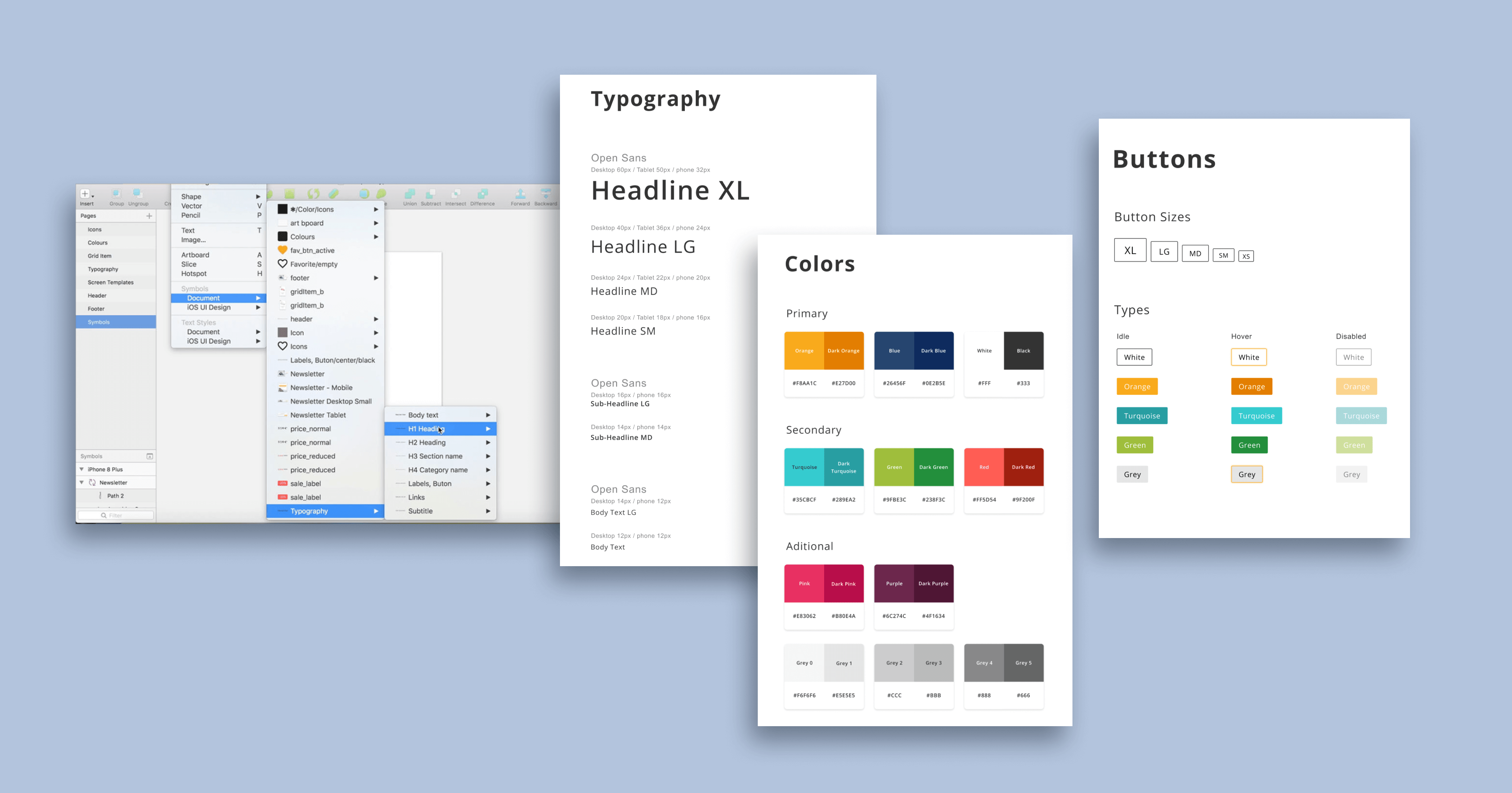
Sketch design library
The library was a cloud-based collection of responsive design artifacts and guidelines, ranging from elements such as colors, icons, typography and buttons, all the way to components such as product cards, header, forms, banners, etc...
This allowed designers fast design iteration times without having to worry about visual consistency.
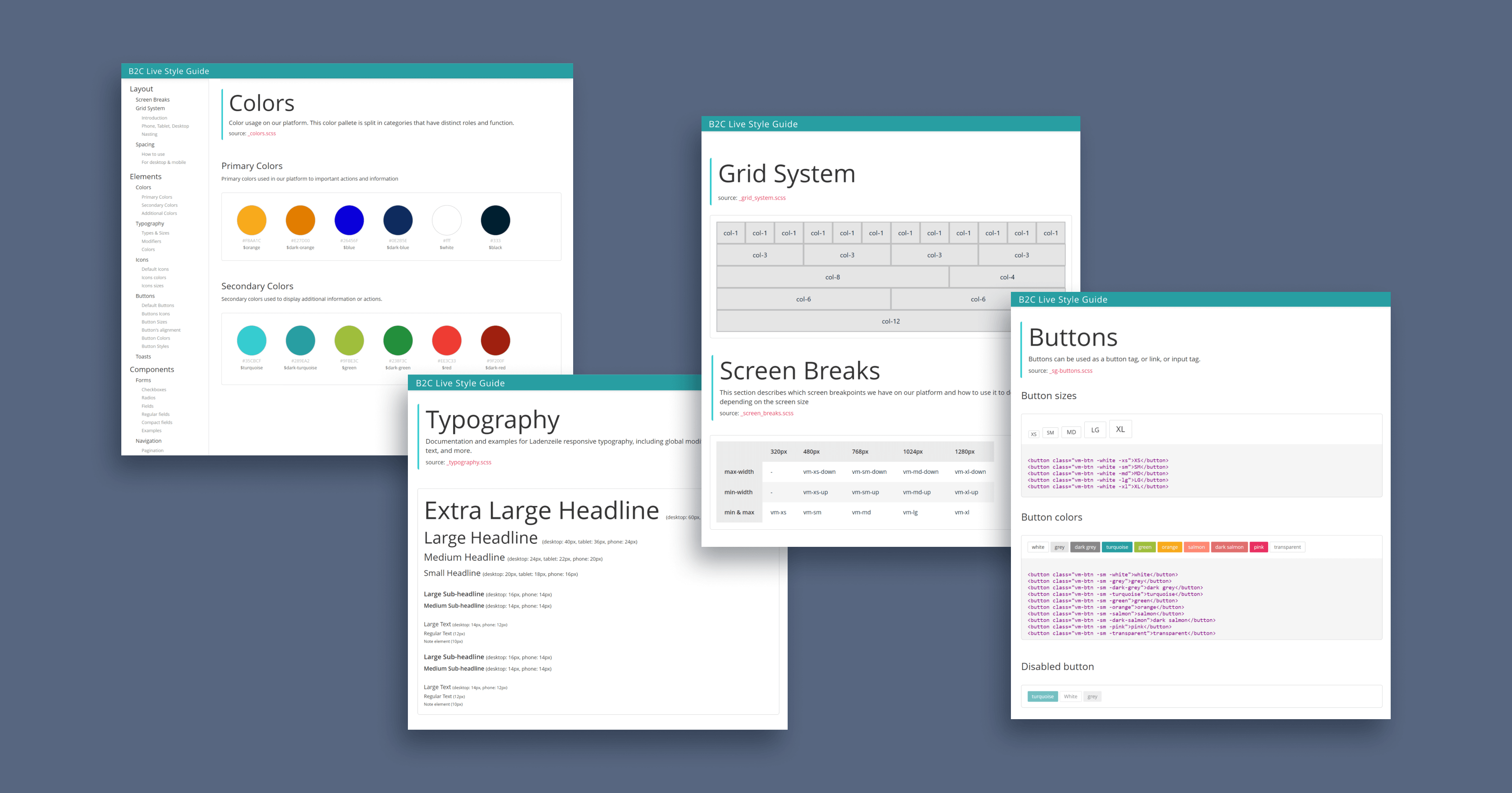
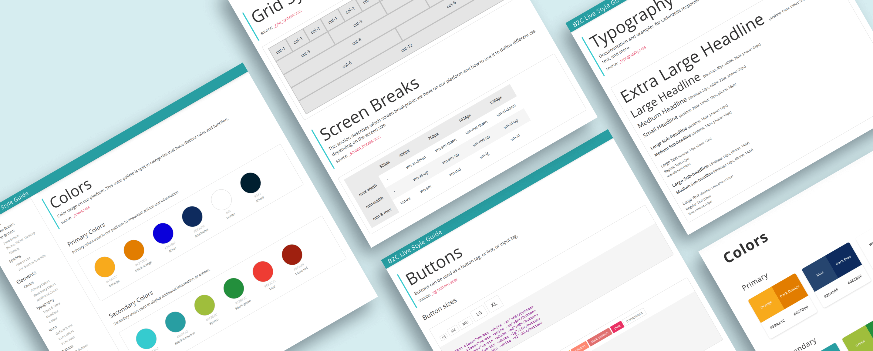
Live Style Guide Page
The elements and components were implemented as CSS and Javascript as a shared library in the frontend application.
We developed the system consisting of "utility" and "modifiers" classes, enabling the developers to directly apply the
styles in the HTML and reducing the need for custom CSS.
A landing page was then developed with all use cases for the elements and components, including guidelines of how to use them, complete with code snippets so that developers could simply copy them and use in production.
Insights and Learnings
Although the decision to go for a "utility class" solution worked well, it was based on the fact that the frontend team consisted mostly of full-stack developers, whom were not very comfortable with CSS styling, it has some problems:
- It breaks separation of concerns between structure and styling, as the HTML is for content and the CSS for how it looks.
- Makes HTML harder to read since its filled with decorative classes.
- A change in how something looks means changing ALL HTML elements that use it.
The next times I implemented similar systems, I preferred to use a global theme-based approach with self-contained components. This addresses the issues previously mentioned and centralizes change.